Looker Studio Dashboard
Looker Studio transforms your Google Sheet into professional-grade analytics without the complexity of traditional BI tools. As a tool, it provides enterprise-level analytics with consumer-level simplicity.
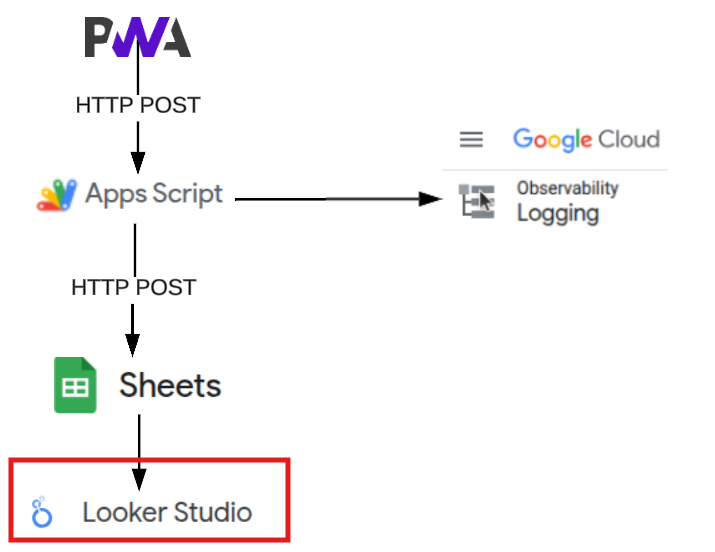
Why Looker Studio?
This was a strategic technology choice, as it can easily transform Google Sheets into professional-grade analytics without the complexity of traditional BI tools.
With accurate data, Looker studio provides the picture so you can identify where you actually spend time vs. where you think you do (and yes, memory is highly subjective).
The key advantages of using Looker Studio with google sheets include:
- Zero Configuration - Automatically detects data types and relationships
- Real-time Updates - Dashboard refreshes as your sheet updates
- Professional Output - Client-ready reports and visualizations
- Free - No licensing costs or usage limits
- Seamless Integration with Google Sheets - Native Google Workspace connectivity
Setup Tutorial
Step 1: Connect Your Data Source
- Navigate to lookerstudio.google.com
- Click “Create” → “Data Source”
- Select “Google Sheets” connector
- Choose your Quick Analytics spreadsheet
- IMPORTANT! Verify field detection and data types - eg: ensure date has loaded as a date field (etc).
Step 2: Create Your Dashboard
- Click “Create Report” from your data source
- Looker Studio automatically generates initial visualizations
- Use the chart properties panel to customize charts based on your analysis needs
Step 3: Essential Visualizations
Looker Studio is responsive and easy to use with many standard charts are provided out of the box, including:
- Time Trends and Line chart: displaying hours per day over time
- Pie chart with time distribution across categories
- Category Breakdowns and drill down tables with dynamic filtering within the dashboard
Design Philosophy for reports
When building out your reports, keep the following philosophies in mind:
- Dashboard Hierarchy: Start with high-level trends, then drill down to specifics. Users need the “big picture” before diving into details.
- Visual Simplicity: Looker Studio’s strength is turning complex data into clear insights. Resist the urge to over-complicate - simple charts communicate better than complex ones.
- Actionable Insights: When developing a chart, think about the question it answers, such as:
- “Am I productive?”
- “Where does my time go?”
- “Which projects need attention?”
- If you have created a visualization that doesn’t drive action, remove it.
Pro Tips
Make use the following features to enhance your report:
- Date filters - Set a global date filter to create weekly, monthly, quarterly or annual dashboards
- Cross filtering - apply cross-filtering to all charts within a dashboard, which allows dynamic filtering to propagate through the dashboard
- Calculated Fields - Create efficient metrics (e.g., productive hours vs. total hours)
- Sharing - Generate shareable links for stakeholder reports
Here’s one I prepared earlier
So, lets find out how much time I have spent developing this system?
Here’s a quick dashboard with logged time entries for this service.